Working with the BBH Los Angeles team, Google tasked us to create an icon for their new global entertainment platform – Google Play. This new service would unite Android Market, Google Music, and the Google eBookstore. It would also be the brand’s first foray into movies.
Our goal was to create a logo that harmoniously united the different product offerings and leaned into the realm of entertainment – all while keeping true to Google’s brand heritage.
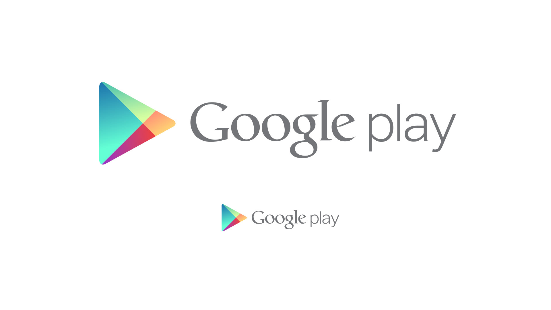
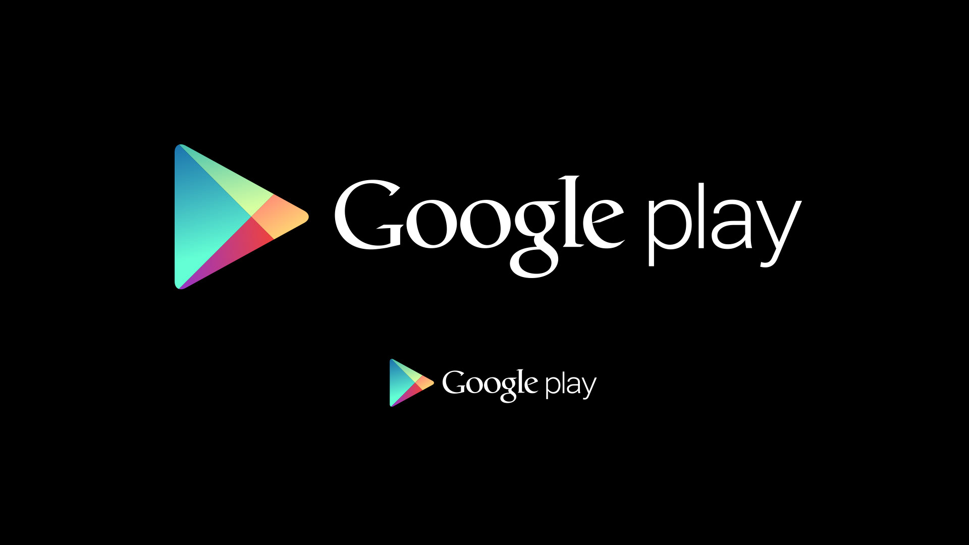
A simple ‘play’ button was the base architecture for the logo. It embodied the complexity of the product while maintaining a clean, modern appeal. The 4-color scheme maintained the ‘Google-y’ spirit but departed from the typical Google primary color scheme. The new color scheme echoed Google’s heritage, but broadened the color spectrum, signaling Google’s entrance to the colorful world of entertainment. This was a monumental departure for Google, both literally and figuratively.
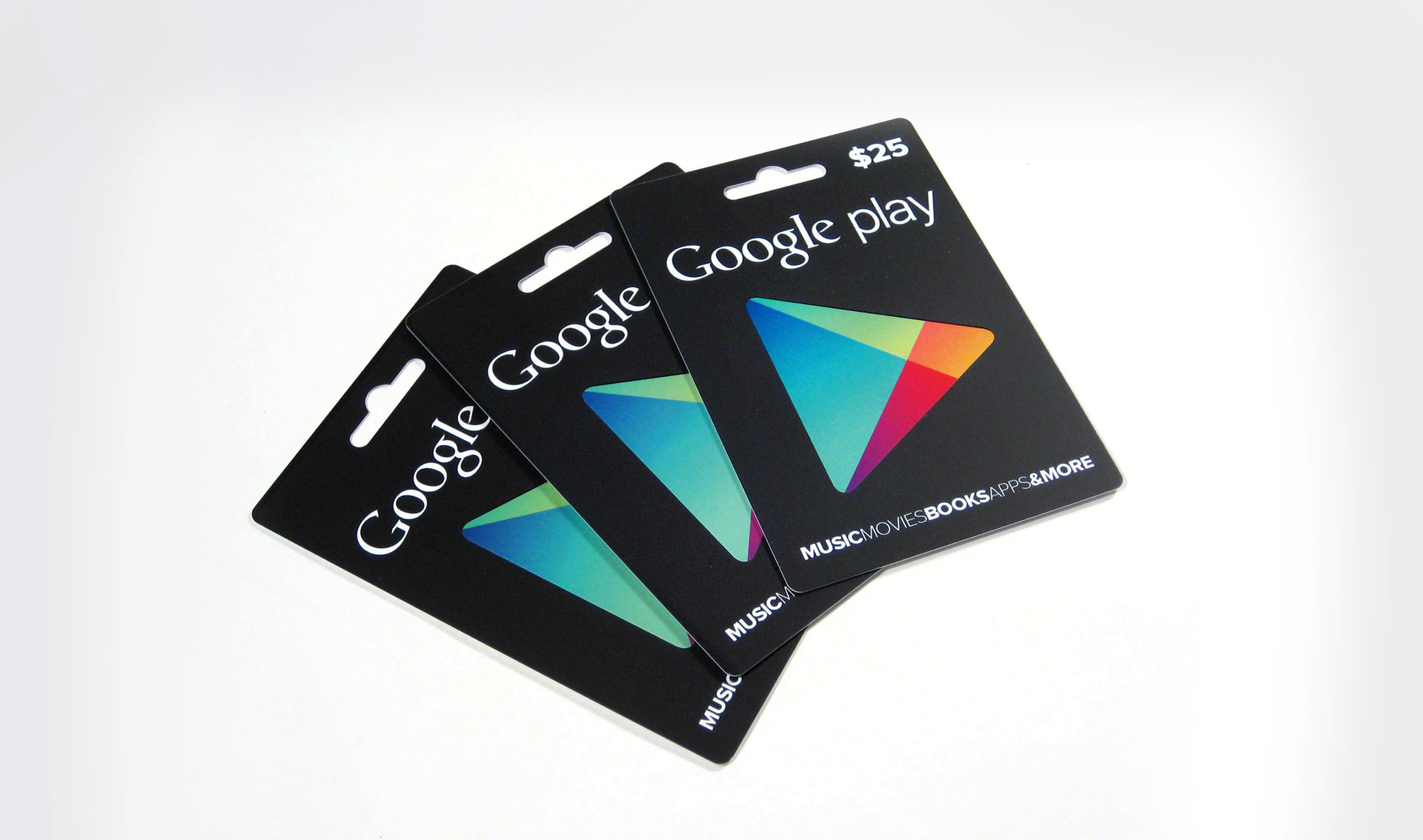
In the logo animation, the colored klieg lights come together to form the Google Play icon. The four base colors represent the four entertainment verticals – Music, Movies, Books and Apps – while the searchlight itself pays homage to entertainment.
Together, colors representing music, movies, books and apps unite to form a ‘play’ button, signaling now that Google has stepped into the world of entertainment…it’s playtime.